

SOCIÉTÉ DE TRANSPORT DE MONTRÉAL
Jeanne Bransbourg, Adam Moffitt
Developed and scanned by Studio Argentique
Adam Moffitt
A familiar jingle accompanies you on your commute. You put on your headphones, open your book, sit back in your seat. Music plays as you gaze out the window, watching the underground speed past you, you pull into the next station. Standing people, on their phones, watching ads, talking to their friends. It’s a daily occurrence, it’s repetitive, it’s your commute.
.jpg)
(1).jpg)
.jpg)
Adam Moffitt // Jeanne Bransbourg
Today, we start our commute at Station Bonaventure, designed by ARCOP, a Montreal architectural firm. We venture into the plaza, greeted by rows of stores and large glass windows. Ice skaters circle in the middle, we keep moving into the underground.
Opened in 1967 and expanded in 1980, Bonaventure is a sample of the entire Montreal Metro’s architectural ethos. Upon entry, the contemporary international design of Place Bonaventure gives way to a now quaint 1960s modernist design.
.jpg)
.jpg)
Jeanne Bransbourg
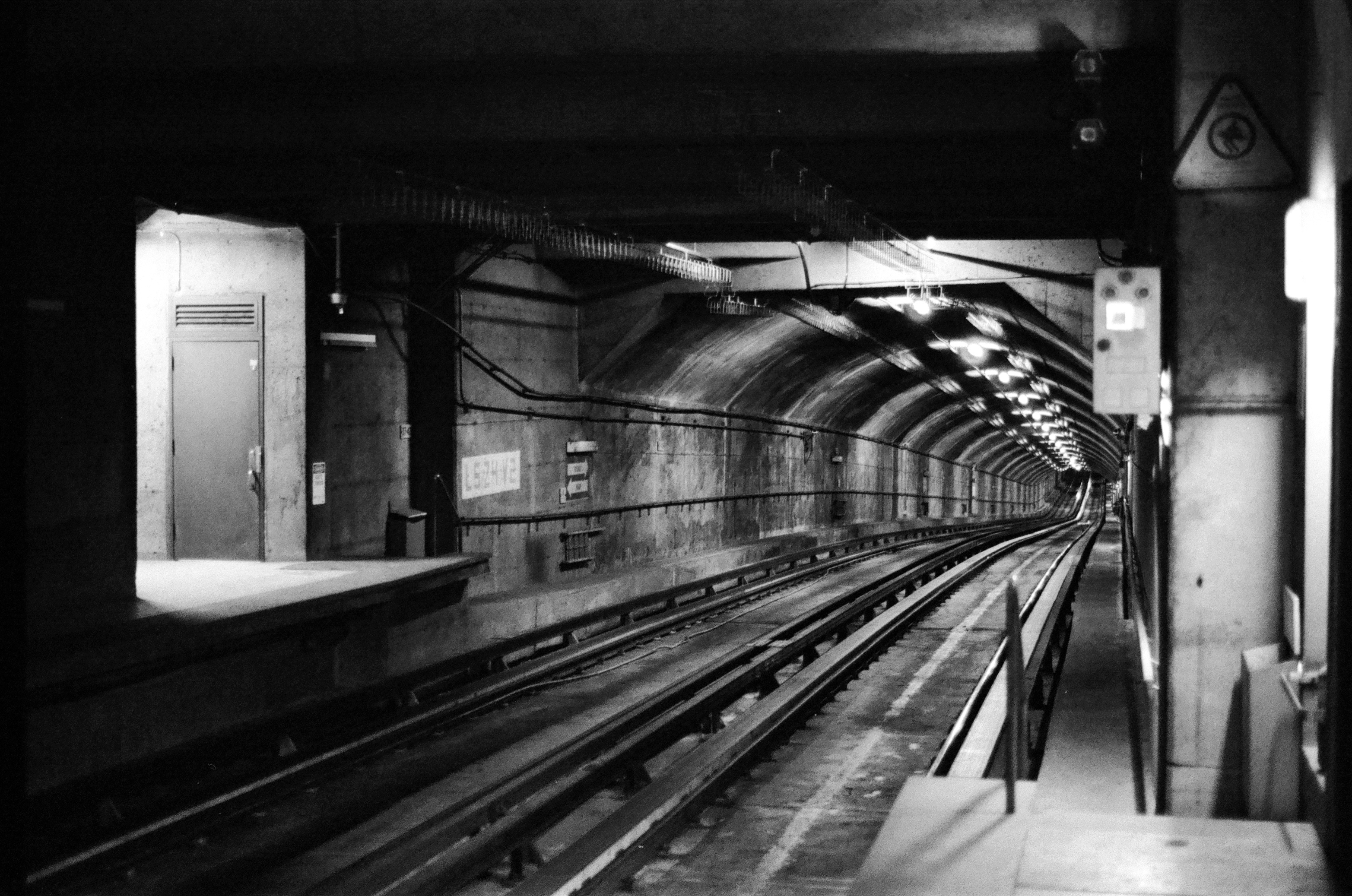
We move down the Orange Line, direction Cote-Vertu, stepping off at Place Saint-Henri. Long lines of lights shine down upon us in between arches and ceilings. A train passes, people stare blankly ahead, they are commuters as well. Direction Montmorency, they are lost in their train of thought.
Ever wonder why the numbering of the lines skips Line 3? In the original planning of the metro system, there was to be a direct, no-stops route from Bonaventure that cut underneath Mount Royal to the north side of the city—unthinkable today. Because planners prioritized the Yellow Line for Expo 67, and because above-ground sections of the tracks required cars with steel tires instead of rubber ones, the plans were canceled.
This was enough to delay expansions to the Orange and Green Lines by up to a decade. While this damaged the long-term funding of the Metro, it did result in much of the Orange Line avoiding the dated, cramped style of the 1960s-era stations. Station-St-Henri is unapologetically brutalist in its design, delighting in vast forms of raw concrete and streams of natural light splayed over broad, unadorned walls.
.jpg)
.jpg)
Jeanne Bransbourg // Adam Moffitt
One stop later, we are at Vendome. Upstairs, the bright orange stained glass windows, designed by Marcelle Ferron, illuminate the station, unbeknownst to the black and white film. It is midday, and the sun shines indoors. Big stainless steel pipes loom above, working in tandem with the panels. The light spreads itself; the sculpture scatters it.
Vendôme is consistent with this style, but with more of a focus on natural light and public art. It took me a long time to think of these stations as “brutalist.” Montreal has possibly the greatest brutalist buildings in the world, such as Habitat 67 and the Musée des Beaux-Arts, but the far more appealing Metro system is usually overlooked.
.jpg)
.jpg)
Adam Moffitt // Jeanne Bransbourg
One, two, three, four, five, the stops zip past us, and we land at Namur Station. Système by Pierre Granche creates a ceiling of lights and shapes, one big caterpillar wrapping itself around the station. It engulfs all, we are at its every whim.
Namur Station is easily the most iconic station of the Orange Line. The Granche sculpture gets most of the attention, but this art piece exists only because of the expansive three-dimensional canvas of the interior of the station.
The emptiness of the northern stations was a problem for the city, as the return on investment for these later expansions was so poor that moratoriums were placed on all future development. Any tourist in Montreal should visit Namur, but few should bother leaving it—the station is more aspirational than useful, like most of the stations we will see in the Blue Line.
.jpg)
Jeanne Bransbourg
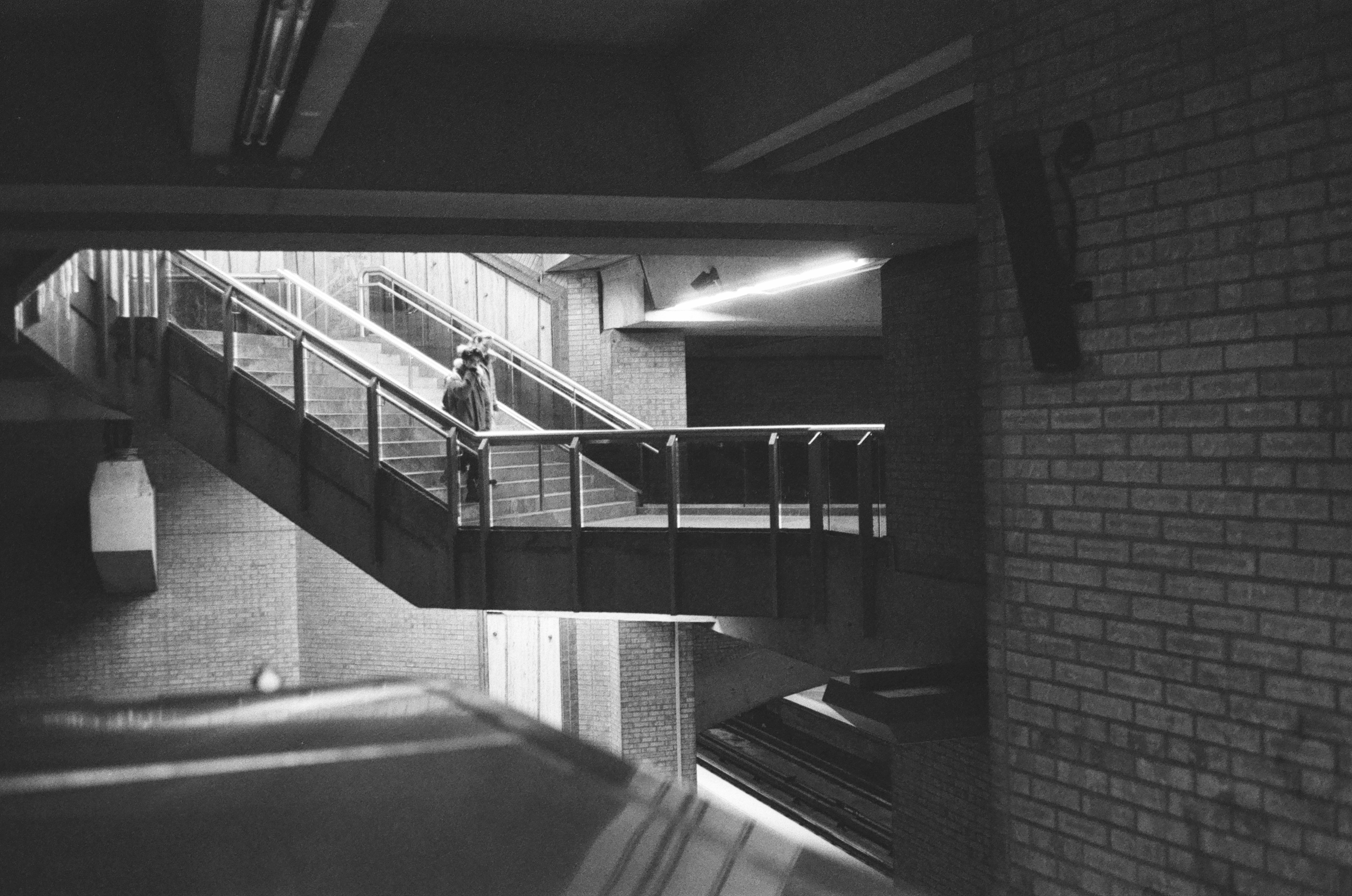
The Orange Line has lost its use, for now. We go down to Snowdon, entering the blue line. A quick transfer, run across the hall, the Metro waits for us patiently, we are at its start.
Snowdon, being a correspondence station, can feel like a step backwards. It has attempts at wider space, but there were just too many moving parts during its original creation and its later expansion for there to be room for much else besides sheer function.
.jpg)
(1).jpg)
Adam Moffitt
At Station Édouard-Montpetit, Patrice Gauthier’s benches of giant hands claw out at us as we step off the never-ending train. They are lost in a shade between red and orange, not sure of their place in the station. The tiles mix and match shapes, this Metro station is somewhere in the unknown. Confusing yet beautiful, I’m not sure what to think.
The Blue Line is the swan song of brutalist design in Montreal. All Blue Line stations were opened during the 1980s, when money, political optimism, and engineering experience came together to create some of the most beautiful stations in the world.
Most people hate brutalism, and despite my praise for the design of the Blue Line, I’m inclined to agree. While it was originally intended to represent a socialist utopian ideology, the movement became so self-absorbed that it cut out the working-class people for whom it was ostensibly designed.
Rags-to-riches stories, such as the one depicted in the now Oscar-winning film The Brutalist, are entirely fictitious inventions meant to rewrite the history of the movement. In reality, mid-century brutalism was plagued by a basic contradiction: it claimed to be architecture for the masses, but the only people who liked and commissioned it were the upper classes, while average people detested it. The style is now an artistic shorthand for totalitarianism and alienation, such as in The Hunger Games, BLAME!, Dune, NaissanceE, Blade Runner, A Clockwork Orange, and Gattaca.
Why do we love the Blue Line so much? How does it escape the pitfalls of its dogmatic aesthetics to create an experience that is unpretentious yet beautiful?
.jpg)
.jpg)
Jeanne Bransbourg // Adam Moffitt
One more stop, a whole new world. Outremont shines out at us, rays of sun cascading down a spiral staircase. Orange tileage on the walls, green light posts, yellow floor accents, Guilbert Poissant’s blue glazed terracotta as you tap your OPUS card through the turnstile. The colors create a haven for the Montreal artist, for the photographer.
Outremont Station is my favorite of them all. The exterior is little more than a circular window that matches the sun’s path throughout the day, letting light spill into what seems like an impossibly high interior. It has a constructed beauty that still feels natural, with its concrete walls being unadorned save for simple, regular tile.
It is also one of the least-frequented stations in the city. This creates a strange, liminal space where human beings look incidental next to the monumental forms of concrete. Far from being alienating, this lonely underground space feels deeply comforting next to the wheeze of the old MR-73 cars.
.jpg)
(1).jpg)
Adam Moffitt
We continue, direction Lucien L’Allier, three more stops, we are at De Castelnau. Hard shaped staircases tumble down into the underground, suspended in thin air. Jean-Charles Charuest creates an homage to Montreal’s Italian community, depicting bas-relief scenes of Jean-Talon, one station past. The people hold carrots and chickens, baguettes and flour. They sell us fruits and vegetables, they clean the market. Lost in the lines, we step back on, two more stops.
De Castelnau is perhaps the most quintessentially brutalist station in Montreal. It looks as though its function is merely by chance, with rails having been built long afterwards to make use of some long-abandoned complex that no longer serves its forgotten purpose. The same comforting loneliness pervades the space, only now without the sunlight: it’s a sleepier station for a quieter commute.
.jpg)
(1).jpg)
Jeanne Bransbourg
Right now, just for now, we skip Jean Talon. We venture a little further, to a small station called Fabre, bluepinkpurplegreen polymer walls. We cannot be lost, we are on the Blue Line. Undulating handrails, interlocking panels. The paint, fresh from 2023, sticks out. Lost again, in yet another sea of colors, it’s time to leave.
Fabre’s entrance rivals the splendor of Outremont for its use of natural light. Sunshine spills down the escalators more readily than people do, cutting angular swaths of light out of the murky concrete walls. This is our last stop from the 1980s, but it makes for a wonderful farewell.
What makes the brutalism of the stations from the 1980s avoid the pitfalls of the previous decades of the movement? I don’t have the answers, but I do have some ideas.
Most importantly, the stations barely have exteriors. Due to Montréal’s harsh weather, the outside structures are usually tucked away between buildings, so that passengers are shielded from the elements. While most brutalist design attracts public ire for its grungy concrete exteriors, it succeeds with its spacious interiors, which are especially desirable in an otherwise claustrophobic underground station.
Besides this, I notice that the alienating, monumental nature of brutalist buildings gives atmosphere to these stations. The way brutalism makes people look and feel tiny is a relief, especially after the crowded, congested tunnels of the downtown sections.
Finally, I enjoy the straightforwardness of the Blue Line—there are no delusions of grandeur rendered quaint by the passage of time. It’s nostalgic without trying to be, and is perfectly willing to let you take your time or rush to your next stop as you please. It reminds us of what brutalism ought to be when it is truly democratized to serve the needs of the public.
Also, the air conditioning actually works there.
(1).jpg)
.jpg)
Adam Moffitt
Down long, never-ending hallways, we are now at Jean-Talon. Suspended signs tell us where to go, not making it any clearer. A sea of people push past us, push us into another hallway, another station, another staircase.
If “architectural whiplash” exists, you will get it when you transfer from the Blue to the Orange Line at Jean-Talon. Jean-Talon is stuffy, cramped, and dirty. This station was never meant to be used by so many people. There are some pleasant stylistic elements such as the hanging signs, but these are few and far between. The station is mostly long, dingy tunnels clogged with scrums of people who just want to go see the market.
.jpg)
.jpg)
Adam Moffitt // Jeanne Bransbourg
After a long descent down the Orange Line, transfer at Berri-UQAM – into the Green Line we go. Four stops later, we are at Préfontaine. Big blue circles with bright white arrows point towards stairways and exits;, panels dotted with holes let light seep through.
The 1970s-era stations are also brutalist, even more so than the 1980s stations of the Blue and Orange Lines.
The only stations opened during this time period are on the ends of the Green Line, with the most interesting expansions being on the eastern end. This was the first major extension added to the system after it was constructed, and being built for the 1976 Olympics, it represents an overlap between the height of brutalism’s popularity and Montreal’s mid-century futurist aspirations.
Préfontaine mixes the pop art style of the 1976 Olympics with broad, raw concrete. Every design element is adorned with playful red trim, which somehow manages not to clash with the stark design of the concrete walls. It feels as though the USSR got into Playmobil.
(1).jpg)
.jpg)
Adam Moffitt // Jeanne Bransbourg
What feels like an eternity later, we are at Langelier. This station can’t make a choice. The difference between lines and circles – with metallic panels full of cut out circles by Charles Daudelin – vertical lines leading you up the stairs, beams of lights in an arched formation illuminating your entrance. Shapes do not exist here; they move around us. SPVM officers ask me what I am doing. I am taking photos, I am documenting the Metro – they walk away, expecting a photo. It is blurry and does not make it into this post.
Langelier has a near-identical design, but instead of angular, rhythmic forms, the station uses broad arches. It also forgoes natural light in favor of fluorescent beams. This draws more attention to the strange staggered blocks of concrete along its stairwells.
(1).jpg)
.jpg)
Jeanne Bransbourg
One more stop, my safe haven. Radisson is unknown to most, only the lucky few who venture to the end of the green line. Protected from the rest of the crowds, Radisson is all mine. This stop is my morning commute, it is where I get off, where I take the bus; it is the bus terminal. There is no art here, but that’s okay, its fantastic domes and staircases speak for themselves. You feel as if entering an underground lair – big and majestic, with accents of orange benches and light panels, metallic and cement structures.
Radisson almost feels out of place. It is the only station not opened during the 1980s which I would characterize as entirely brutalist, and it is just as airy and open as any of the Blue Line stations. It is my favorite Green Line station by far.
Thank you for your time. Use us as a guide; go explore the STM before you leave.
Jeanne Bransbourg
(2).jpg)
Jeanne Bransbourg